

Sourcebook: Really Great Interiors On-Screen
A look (through screenshots) at a few of my favorite film & television interiors.

This week’s sourcebook is a visual reference of a few of my favorite on-screen interiors.
First up, is Diane Keaton’s Manhattan apartment in Baby Boom. No one can make Le Corbusier look more chic. And don’t get me started on the bedroom styling- the Tizio Micro Artemide Lamps accompanied by Noguchi-esque Paper Bedside Lamps (in general, I am a big fan of double-layered bedside lighting), a fully equipped nightstand, and a floral arrangement.


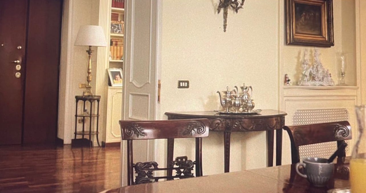
Following, we have Florence in the 1970’s, via Elena Greco’s garden apartment in Elena Ferrante’s adapted My Brilliant Friend. Of note: the butter sofa, the unassuming, colorful kitchen, Pietro’s home office, and of course, really great glassware.


I absolutely love English interiors. There is always an ease and approachability to their rooms, and Brideshead Revisited is no exception. Just look at the lopsided lampshade and the sat-on pillows. There’s intentionality behind a room not looking too perfect. If you look closely at more traditional interiors in the past, especially English and American interiors, you’ll notice the prominent use of two colors (often together): blue and red. My grandmother always believed that a room should never be without the color red- either subtly, or blatantly. You can see in just a few stills below, how the color red makes an appearance- through an open book resting on an ottoman, a layered carpet, a side chair, or painted walls.


Paolo Sorrentino always carries the ability to completely transport a viewer through his on-screen interiors, evoking emotion and wonder. In his film, Hand of God, viewers travel to Napoli in the 1980’s. I love the simplicity and nostalgia of his interiors.


While not necessarily film or television, I wanted to include stills from a House & Garden interview I once watched, featuring Axel Vervoordt at home. Notice the red and blue combo again! I appreciated his home tour, because it was so evident how uniquely his this home really is. It does not follow a set of interior design rules or principles (look at the totally mismatched dining chairs), but rather, each room takes on its own form, according to his preference. There is an eclectic collector’s touch, balanced by breathability and minimalism, creating a very unexpected harmony and state of equilibrium. Even his dog looks at max peace in his home.


Elena Ferrante’s My Brilliant Friend makes a second appearance here for its additional interiors and set design.


Also making a second appearance is Baby Boom, because we LOVE a good country home. The florals, the wallpaper, the window treatments, the exposed kitchen pots and pans, the gingham cabinet curtains, the lampshades, the total charm!!!


And lastly, a really good, very random interior still that I screenshot a long time ago, but cannot remember what I was watching during the time.